Cart 0


Welcome to the future of interior design! In this article, we are going to take you on a journey into the year 2024 and explore the color that is set to dominate home decor trends.
Get ready to be inspired as we unveil the Color of the Year 2024!
Colors have the power to transform a space and evoke emotions, making them a crucial element in creating a harmonious and inviting environment.
The Color of the Year sets the tone for the upcoming year, influencing everything from furniture and paint choices to accessories and accents. Colors not only reflects our collective consciousness but also provides a glimpse into the future of design.
So, get ready to step into the future and discover the Colors of the Year 2024 for interior design. Let’s explore the hues that will shape our living spaces.
Sherwin-Williams Color of the Year: Upward


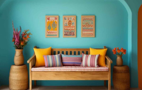
Upward by SW paint colors is a captivating color that can add a touch of serenity and tranquility to any interior space. With its soft, pale blue hue, Upward exudes a sense of calmness, creating a soothing atmosphere within a room.
This color is particularly suitable for bedrooms, living rooms, or any space where relaxation is desired. Upward has the unique ability to create an open and airy ambiance, making the room feel more spacious.
Its understated elegance pairs beautifully with white or neutral furniture, while also complementing other shades of blue or gray for a cohesive and harmonious interior design.
Whether it’s used as a main wall color or as an accent, Upward by Sherwin-Williams can effortlessly infuse a sense of tranquility and sophistication into any living space.
Glidden Color of the Year: Limitless

Color of the Year for 2023, Limitless, holds immense potential in the field of interior design. This captivating color is a harmonious blend of warmth and sophistication, making it an excellent choice for transforming living spaces.
Limitless emanates a sense of vitality and adaptability, offering endless creative possibilities. Its subtle gray undertones create a calming effect, while its soft, dusty pink hue adds a touch of elegance and charm.
Whether used as a main color or as an accent, Limitless can effortlessly create a contemporary and inviting ambiance. With its versatility and timeless appeal, this color empowers designers and homeowners to push boundaries and explore their boundless creativity when it comes to interior design.
Cracked Pepper – Paint Colors Behr


Cracked Pepper is indeed a wonderful behr colours choice for interior design. Its combination of charcoal gray and blue tones creates a sophisticated and versatile shade. The beauty of Cracked Pepper lies in its ability to be both visually striking and calming, making it suitable for a range of interior spaces.
In living rooms, Cracked Pepper can be used as an accent color through throw pillows, curtains, or even a statement wall. It adds depth and richness to the space while providing a touch of elegance. In bedrooms, this color can create a serene and soothing atmosphere, especially when paired with softer shades like cream or pale blue. It can be incorporated into the bedding, curtains, or even a cozy rug.
For offices, Cracked Pepper can bring a sense of professionalism and sophistication. It can be used on the walls, furniture, or as an accent color in artwork or accessories. Its versatility allows it to blend seamlessly with different color palettes and design styles, whether you prefer contemporary, traditional, or even minimalist aesthetics.


Overall, Cracked Pepper is a fantastic choice for interior design, offering a balance between power and tranquility. Its ability to complement various spaces and design elements allows you to create a stylish and cohesive look.
Viridis by Graham & Brown


Viridis is a captivating color from the Graham & Brown collection that exudes a sense of freshness and tranquility. Inspired by the lush beauty of nature, Viridis is a soft and serene shade tinged with a hint of jade green.
It offers a harmonious balance between invigorating vibrancy and soothing calmness. Like a breath of fresh air, this color has the power to elevate any space and create a soothing atmosphere.
Whether used as an accent or a focal point, Viridis adds a touch of natural elegance and invokes a sense of rejuvenation and harmony. It is a versatile color that can be incorporated into various interior styles, creating an inviting and serene ambiance in any room.
Valspar Color of the Year: Renew Blue
Valspar’s Color of the Year for 2023, Renew Blue, is a refreshing and invigorating hue that ignites a sense of renewal and rejuvenation.
Renew Blue brings a sense of peace and serenity to any space. This shade of Blue has been carefully curated to evoke feelings of clarity, mindfulness, and a fresh start.
Whether incorporated into interior designs or used as an exterior accent, Renew Blue effortlessly adds a touch of sophistication and modernity to any setting.
Its versatility allows it to complement a variety of color palettes, making it an exciting choice for those looking to infuse their living spaces with a vibrant yet tranquil ambiance.
With Renew Blue as the Color of the Year, Valspar invites individuals to embrace a renewed sense of peace, harmony, and a connection to nature.
Color Of The Year Blue Nova by Benjamin Moore


Benjamin Moore’s Blue Nova color can be a beautiful option for interior spaces. This color is an excellent choice to create a fresh and cool atmosphere. It is often used in areas such as living rooms, bedrooms, or study rooms.
Due to its light blue tone, Blue Nova gives rooms a peaceful and relaxing feel. This color blends well with natural and neutral colors. When combined with colors like white, gray, or beige, it can create a pleasant balance.
Additionally, it pairs wonderfully with wood and natural textures. However, it is important to remember that each space has its own unique characteristics.
Depending on the room’s lighting, furniture, and other decorative elements, Blue Nova can have a different effect. I recommend doing thorough research or seeking assistance from a designer before integrating this color into your interior space.
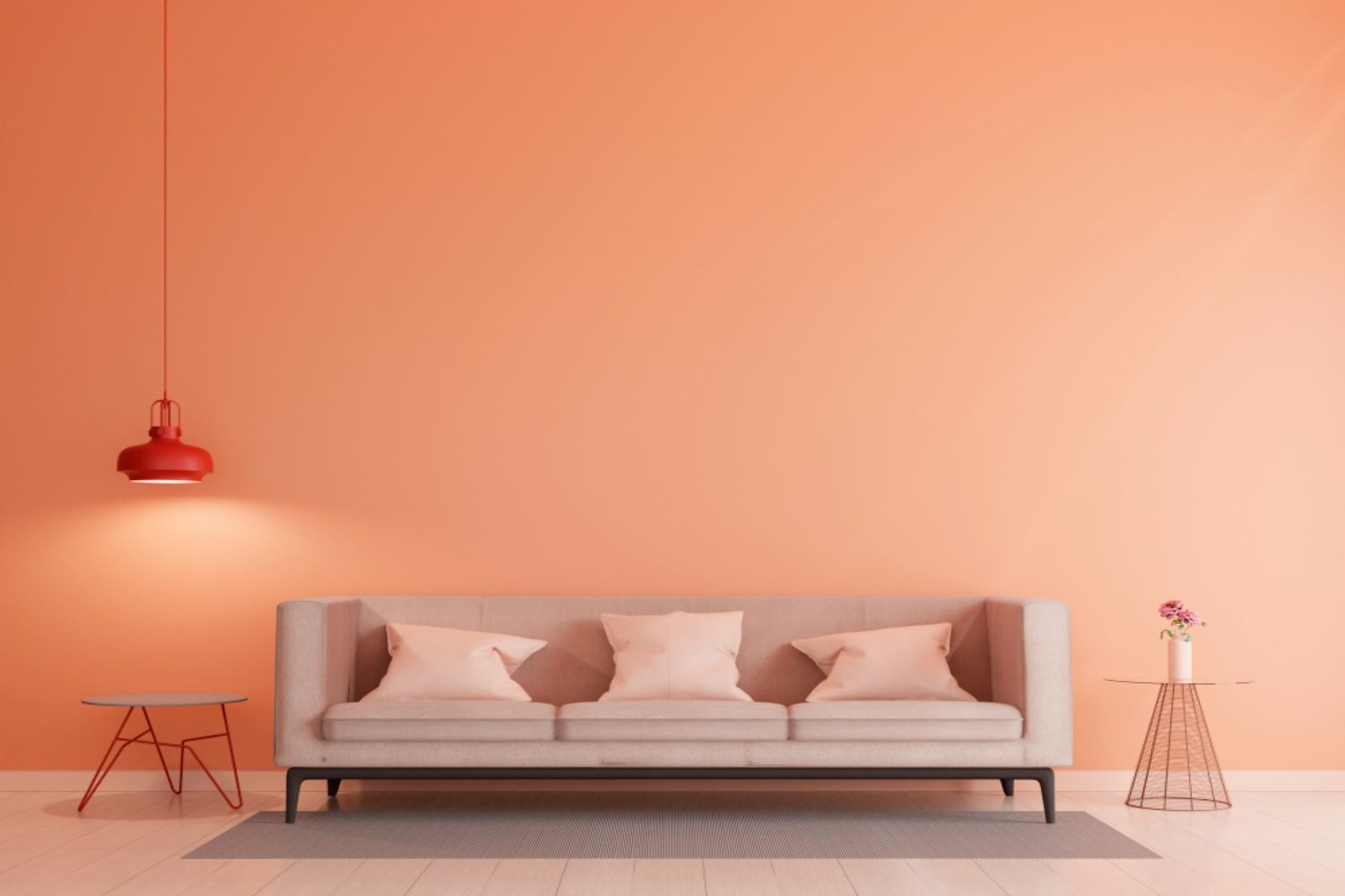
Pantone Color of the Year: Peach Fuzz
Regarding the Pantone Color of the Year, it is certainly true that the soft persik tone creates a feeling of warmth and joy in interiors. This color can be a great option to add a pleasant atmosphere to the room.
By using Peach Fuzz walls or furniture in living rooms, you can increase the satisfaction of your guests by making them feel comfortable. In bedrooms, you can choose this tone to create a romantic atmosphere and encourage relaxation.
Using Peach Fuzz accessories in the kitchen can help you liven things up by increasing your energy while cooking. This color adds warmth, spaciousness and elegance to interiors, giving your room a nice touch and a contemporary feel.
As a result, decorating your interiors with Peach Fuzz can help you create a peaceful and friendly atmosphere.